Product Grid
Configuring the Product Grid
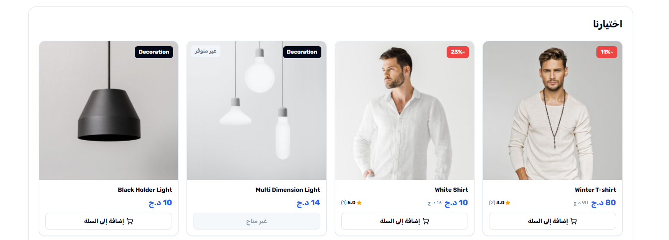
The Product Grid is the workhorse of your homepage — a full grid of product cards that acts as the main catalog window. Where the Product Carousel is best for curated, narrow selections, the Product Grid is built to show breadth: dozens of products at a time, with pagination so customers can keep loading more without leaving the homepage. It also offers a slider variant for cases where you want the grid look but the horizontal scroll behavior.
Opening the Product Grid section
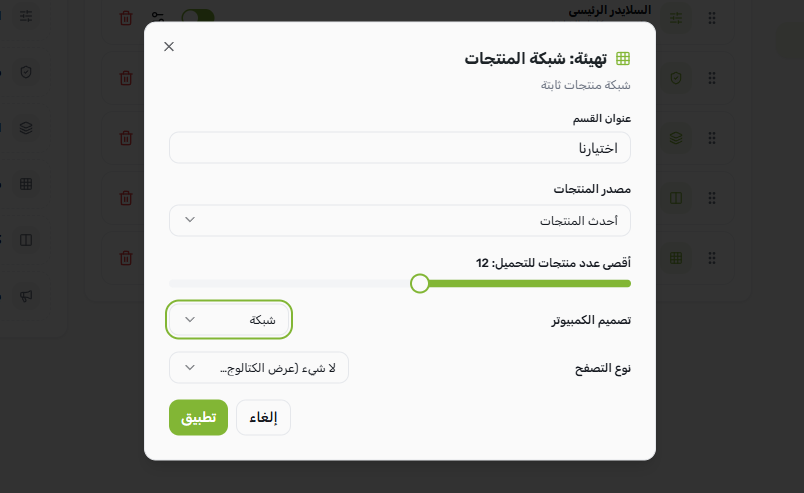
Go to Yaxii COD > Settings > Homepage Layout. Find the Product Grid card and click it to expand. If you do not see one, click Add Section at the bottom of the list and choose Product Grid.
Configurable fields
| Field | What it controls |
|---|---|
| Title | The heading above the grid (for example, “Our Selection” or “Browse the Catalog”). Leave empty for a heading-less grid. |
| Data source | What products to display. Same four choices as the Product Carousel: Latest, Best Selling, On Sale, or a specific category. |
| Max items | How many products to load (default 12). When pagination is enabled, this is the count per page. |
| Layout mode | Choose between Grid (multiple rows of product cards) and Slider (single horizontal scrolling row, similar to a Product Carousel but using the grid styling). |
| Pagination type | Only applies when Layout Mode is Grid. Controls how customers see more products. See the next table. |
The four pagination types
| Pagination type | How it behaves | Best for |
|---|---|---|
| None | The grid shows the max item count and stops. A “View the full catalog” button below the grid sends customers to the shop page. | Smaller stores or when the grid is meant as a teaser, not the full catalog. |
| Load More | A button appears below the grid; tapping it loads the next batch of products inline without a page reload. | Mobile shoppers — fewer clicks, gentler than infinite scroll. |
| Numeric | Classic numbered page links (1, 2, 3, …) appear under the grid. | Customers who like to jump to a specific page or know how deep the catalog goes. |
| Infinite | New products load automatically as the customer scrolls toward the bottom of the grid. | Discovery-driven shopping where you want customers to keep browsing without thinking about page boundaries. |
Setting up the main catalog grid
- 1Open the Product Grid sectionIn the Homepage Layout panel, click the Product Grid card to expand it.
- 2Set the titlePick a clear heading like “Our Selection” or “All Products”.
- 3Choose a data sourceMost stores use Latest here so the grid always reflects fresh inventory.
- 4Set max items per pageA value between 12 and 24 is typical. Higher counts load more products per request but increase initial page weight.
- 5Keep Layout Mode as GridSlider mode is only useful if you want a single scrolling row — for a real catalog, Grid is the right choice.
- 6Pick a pagination typeFor most COD stores, Load More performs best on mobile.
- 7Save SettingsClick Save Settings. The grid appears on your homepage immediately.
How grid columns are decided
The number of columns in the grid (on desktop) is controlled by a separate setting in the Archives tab — see the Product Page and Catalog Layout documentation. On mobile, the grid is always 2 columns; on tablets, 3 columns; on desktops, it follows your Archives setting (4, 5, or 6 columns).
What’s Next?
The product showcases are in place. Next, configure the Promo Banner — a clickable promotional image that breaks up the rhythm between product sections.