Colors And Typography
Brand Colors & Typography
Most WooCommerce themes scatter color and font settings across the WordPress Customizer, Elementor global styles, and buried CSS fields — making a simple brand color change a multi-step hunt across three different panels. Yaxii COD consolidates every visual identity control into one screen. One save rewrites buttons, links, headings, cards, and borders across every page of your storefront simultaneously.
Opening the Colors & Typography Section
In your WordPress dashboard, go to Yaxii COD > Settings, then click the Colors & Typography tab in the left sidebar.
Changing Your Brand Color
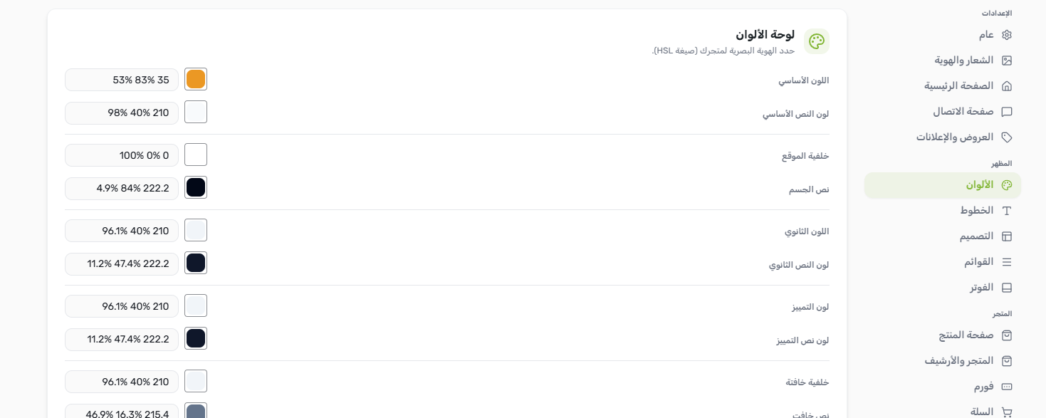
The Primary Color is the single most important color in your store. It controls the fill of your main action buttons (Add to Cart, Order Now), active link colors, cart totals, progress bars, and highlighted interface elements across the entire storefront.
- 1Open Colors & TypographyGo to Yaxii COD > Settings > Colors & Typography. [Screenshot: Settings sidebar with the Colors & Typography tab highlighted]
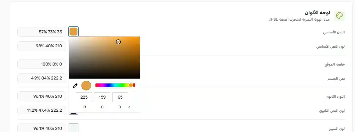
- 2Click the Primary Color swatchThe current color appears as a filled circle. Click it to open the color picker. [Screenshot: Primary color swatch with the picker open beside it]
- 3Choose your colorSelect a color from the picker or type a hex code directly (e.g. #E63946). The live preview inside the panel updates as you pick. [Screenshot: Color picker with a hex input field filled in]
- 4Save your settingsClick Save Settings at the top of the panel. Your new brand color goes live across the entire store immediately. [Screenshot: Save Settings button in the panel header]
Advanced Color Controls
Beyond the Primary Color, the panel exposes the full storefront color system for merchants who want finer control. Each token controls a specific visual layer:
| Color Token | What It Controls |
|---|---|
| Background | The main page background (default: white). |
| Foreground | The main body text color. |
| Secondary | Backgrounds for secondary buttons, badges, and subtle UI areas. |
| Accent | Hover states, active tabs, and selected states. |
| Border | Card borders, input field outlines, and section dividers. |
| Destructive | Error states, remove buttons, and out-of-stock indicators. |
Typography Settings
The typography controls set the font family, size, weight, and line spacing for every heading and body text element across the store — no font plugin required.
| Setting | What It Does | Default |
|---|---|---|
| Heading Font | Font family applied to all H1–H6 headings on the storefront. | Rubik |
| Body Font | Font family for paragraphs, labels, and navigation text. | Rubik |
| Base Font Size | The root size in pixels. All other text scales relative to this value. | 16px |
| Heading Weight | Boldness of headings (400 = regular, 700 = bold). | 700 (Bold) |
| Body Weight | Boldness of body text. | 400 (Regular) |
| Line Height | Vertical spacing between lines. Higher values improve mobile readability. | 1.5 |
Layout Controls
Two layout settings in this section shape the storefront’s overall visual structure:
- Container Width — The maximum width (in pixels) of the content area. The default is 1200px, which suits most screens. Reduce it for a narrower, editorial look.
- Border Radius — Controls how rounded buttons, cards, and input fields appear. Set to 0 for sharp corners; raise toward 16 for a softer, modern style. Default is 8px.
What’s Next?
Brand colors and typography are set. Next, configure your logo, navigation icons, announcement bar, and footer from the Header & Footer section.